.
.
.
1. How Do Points Become a Curve?
Among many samples of health data visualizations I’ve seen, none of them provides a clearly understood graphic addressing the question of whether OC is “flattening its curve” of new COVID-19 cases (or ICU admissions, or deaths, all of which are useful things to track), so I decided to roll my own. Before getting to that, let’s take a look at some of the useful resources that are out there.
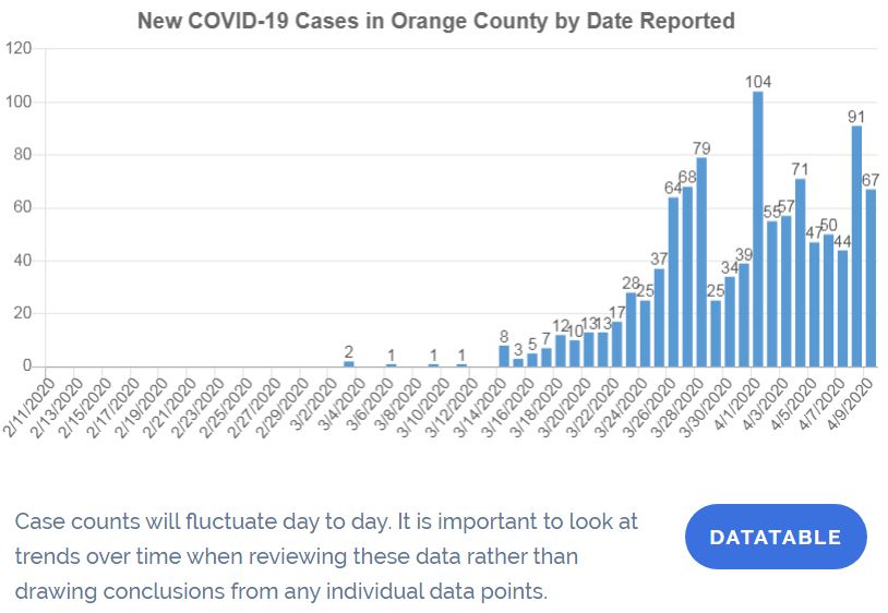
Click for larger image.
The chart above (which you can click on for a larger image) is what you’ll get from OC’s official COVID-19 site. (You’ll also find a find a similar graph of total deaths.)
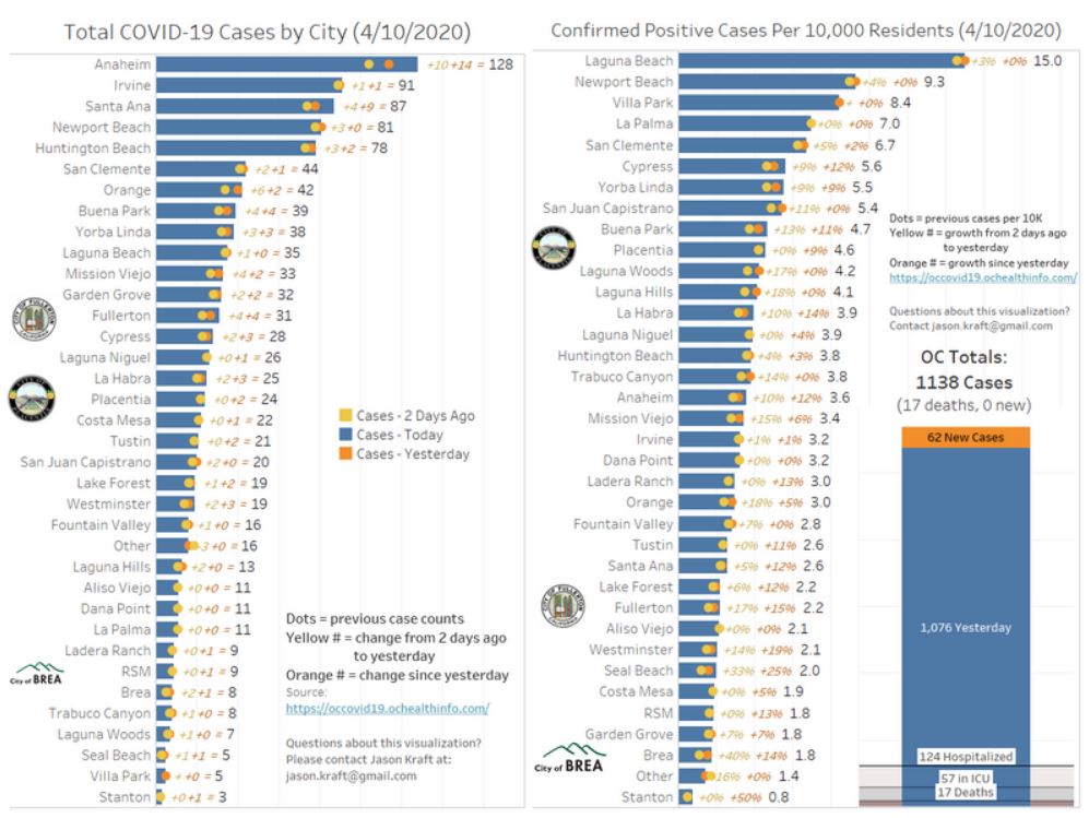
Click for larger image.
This second graphic (on which you can also click) is a really good contribution by Jason Kraft of Brea, whose work specialty includes data visualization (though this is a freelance effort from home.) (I’m very happy to showcase it here.) He offers data in each city, showing cases both in absolute terms and as a proportion of that city’s data. (The icons of Brea, Placentia, and Fullerton show his local interests.)
If you look at the admonition at the bottom of the top drawing, that’s what I think has been missing. (I’d love to be wrong — it would save me a lot of future work — so if you know of someone else who’s doing this please let me know!) Statisticians remove some of the “noise” (or random variation) in these sorts of graphs by recognizing the the exact timing of a case appearing in the database is an imprecise measure of when it reached the criterion for inclusion that most other cases do.
Given that, we can represent the value for each day as being the average of the period — usually three, five, or seven days — in which it is centered. This is called “smoothing the curve” — and that sends us into a little detour on introductory statistics.
2. What is this Curve We’re Trying to Flatten?
When we don’t know what a curve looks like, in most cases — and for good reasons I won’t get into here — we approximate it with something called a normal distribution, which tells us what proportion of the cases will have a given value on the horizontal axis. (In this case, as is common in epidemiology, the horizontal axis denotes “time.”) Plotting the points on a normal distribution gives us a “normal curve” — the most famous of the “bell-shaped” curves.

Normal curves can differ in important ways. The first two of these, mean and “standard deviation” (related to variance), are fairly well known. (This graphic from Wikipedia illustrates them — the standard version of the normal curve, with standard deviation =1, is in red.) We don’t know where the mean of our curve for COVID-19 cases in OC is at this point, so ignore the green variation on the standard curve. We’re looking at the red version, which we don’t want to turn into the blue version, and which we do want to turn into the gold version. In other words, the red version is the one that we want to “flatten.”
Why is that? Let’s say that the faint line beginning at the “0.2” mark on the left — which is when 20% of the population is affected — refers to the proportion of people whom we can treat in our medical system in one day. (In other words, pretend for now that we could treat 20% of the people in OC who will eventually get the virus at once. The number is actually much lower than that.) Everyone beyond limit that would be on their own. Not everyone dies without treatment, but a certain proportion — based on factors such as pre-existing conditions — is expected to die.
Looking at the red curve, a lot of people die. Looking at the blue curve, which we’d see if people actively sought out the virus to get it over with, as used to be the custom with chicken box, a much larger proportion of people die. But with the yellow curve, literally no one dies for lack of treatment, which is another way of saying that everyone except those who don’t respond to treatment does not die. The trade-off is that we then have to live with the disease for a lot longer — but we’ll be able to treat them all, rather than denying some people treatment due to scarcity. And if we put off as many infections as we can for long enough, by then we may have a vaccine or a cure.
This is why we are engaging in social distancing: to keep the total cases below the level at which we can’t cope with them.
Until we get to the peak, we don’t know where we are on the curve. Being at the 0.2 level could mean that we’re peaking on the gold curve, or about halfway to peaking on the red curve, or less than a quarter of the way to peaking on the blue curve. That’s why people are asking the big question: “when we will peak?”
It’s more complicated than this, of course. Technically, we are also looking for a curve that has negative kurtosis (a normal distribution with a flatter peak and thicker tails) and positive skewness (where the right tail is thicker than the left tail.) And the curve that we would derive by the end would likely depart from normality because we’re trying to change it in midstream. But if you understand the general concept — that we are trying to stuff down that too-large group of people in the peak so that a goodly number of them will end up in the right tail of the distribution, where they don’t overcome our capacity — then you should be able to follow the level of discussion for non-experts.
OK, now I’ll take a question from our imaginary audience: Yes, we could try to “get it over with” — but only at the cost of a lot of people dying unnecessarily. And those who think that they will surely be able to buy their way into the ICU with plenty of oxygen and sure access to a ventilator should not be smug: people will die even with treatment, but less of them will die in the future, when our knowledge of prevention, treatment, and cure will be better than it is right now. (If you think that hydroxychloroquine will save you, you might turn out being right, but you’re far more likely to have gambled your life on snake oil. We’ll have much more information in the months ahead.)
But how do we get from that bar graph at the top to a curve that we can actually examine to see what it’s doing?
Glad you asked!
3. Smoothing the Curve
At the bottom of that top graphic, it warns you that you don’t want to put too much emphasis in looking at the single data points, representing the number of cases on a single day. But what’s the alternative? What statisticians do with what is called “noisy” data — see how it’s jumping all around in that top graphic from day to day? — is called “Smoothing the Curve.”
The idea is this: if a phenomenon occurred on a given day, small changes in probability — based on small changes like how much sleep they happened to get, or whether they were too busy to get tested, or where their test ended up in the pile of tests to be processed in the lab — may move the date when they get confirmed as positive or negative for the virus. Rather let that random variation drive us mad, we can instead represent each day as the average of itself and the small number of days on either side of it. So what I’ve done is to take that array of dots and turn them into something more informative.
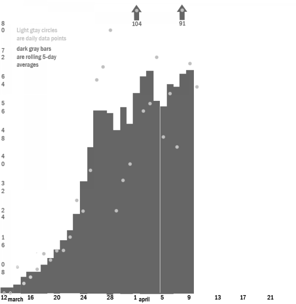
In this graph, starting with March 12 (which means that I’m leaving out the first cluster of cases that dropped back to 0), , I created a bar graph for each day through April 9, along with the dots representing the individual amount for each day (that is, the same information you see in the top graph) and the two days before it and the two days after it. (You may not that there’s a dot but no bar for April 10 — the evening of which being when this was written — because the likelihood is too great that is will be significantly changed. I included the bar for April 9, despite that it has only four of the five days accounted for, because I doubt it will chance by that much.)
This, finally, gives us something close to a curve that we can inspect and use to make predictions.
With the smoothed curve, we can see what looks like an inflection point (where it changes from concave to convex) around March 24 — though it’s both difficult and unnecessary to pinpoint an exact date. We have an extreme outlier of reports on April 1 too large to fit onto the scale, and a similar but smaller outlier on April 8, both of which serve to produce a gap on April 4 and 5, where the first has departed and the second has not yet arrived. (A 7-day smoothed curve would not have show as much gapping.) What it looks like to me is that confirmations of tests are coming with gaps between batches — with a smaller outlier on April 4 and a previous one on March 28 — but that may not be the right explanation for this noise. (Note that the cases reported on a given day consist only of ones counted through the previous day, so the April 1 report, for example, includes only cases reported through March 31.)
If we are nearing a peak, though — even one in a distribution with an asymmetric fatter right tail — there’s still a problem. As Kraft notes in his graphic, the total number of cases as of the April 9 report was 1,138, which resulted in 17 deaths. That seems far too low to be anywhere near the halfway point for a county as large as OC (though of course it doesn’t include mild cases or those that were mistaken for Influenza A or B, the strains that were running roughshod here during the winter.)
To me, and here I’m beyond my comfort zone, it suggests that our social distancing has been extremely effective — but also that a large part of the population remains vulnerable to new waves of infection coming from outside the county. If so, we can prepare for them now, figuring out which industrial sectors can be relaxed as well as how we’ll apply the best lessons we’ve learned about safe distribution of goods to people in a more careful and systematic way. If what we’ve experienced right now is a foreshock, we have been blessed with time to prepare for the Big One and its aftershocks.
Speaking of “blessed” — I don’t know if any churches here are planning huge gatherings along the lines of what we’ve seen elsewhere in the country, but that’s the sort of thing that could generate a new wave as this one rolls over us. So turn on your TV, get in contact with your friends and family online and by phone, and have a safe and happy Easter at a good distance from harm!
My current plan is to do these updates once a week — but that too is hard to predict.
This is your Weekend Open Thread – talk about this or whatever else you’d like, consistent with applicable guidelines.


“Peak?” “Is that like a Peak Experience?” “Or, just take a Peek?” Or Daddy, are we almost there?” Or: “I’ll believe it when Disneyland opens all its parks!” Or: “I’ll believe it when the NFL Opens its new stadium in Las Vegas and it is packed….wall to wall.”
Settle down, it’s a Widow’s Peak.
*Chairman Vern, is that like “a Widow’s Peak”? We know what a “Flat bottom” is however…that is what they call a ski or drag boat.
Mmrrrrmmmmffff???
Bernie & Biden take on Trump
Hey Vern, I understand the importance of rejecting the SAPD corruption, but are you sure that a supporter of Trump’s dystopian world is the best person to combat a police state?
You may have received this info from your fellow Dems :
“The Santa Ana Special Election on May 19 is now VOTE BY MAIL ONLY. Let’s make sure everyone knows to vote YES to recall Republican Ceci Iglesias, and YES for Democrat Thai Viet Phan!
If elected, Thai Viet Phan would be the first Asian American elected to Santa Ana City
Council.”
A reminder of Trump’s bloody deeds:
Relevance, buddy.
Nice ironic comment on everything wrong with local politics in OC. Reform, but only reform if it has the right star on its belly.
Buddy…? I am not in the Moscow Mitch train. What happened to your attempts to transform the county GOP>\?
Trump happened.
I think that we clearly need a post (and according comments section) devoted to the Santa Ana recall. This is an important and contentious topic and we’re not going to be able to find it here in a WOT with a theme about something else.
I think it’s valuable to have AT LEAST ONE DAMN member on a council who will stand up to the police unions, criticize and ask questions, no matter how dumb a lot of her other positions are (which aren’t in danger of happening anyway as she’s one out of 7)
I think it’s extremely disturbing that the police union can’t handle ONE DISSENTING VOICE on a Council, and also that so few people on the left see that as disturbing, and that they are obviously using Ceci as an EXAMPLE so that no politician will dare question them in the future. WE ALL HAVE TO STAND AGAINST THIS RECALL.
Vern, this is not the time to support Trumpistas. Check and expand the link I posted in my previous comment to you.
I don’t need to be reminded how bad Trump is. I fight him every day.
Letting the Santa Ana police union run roughshod over local democracy is not the way to get Trump out of office.
Chicken Dinner.
Are any of the challengers willing to take a similar pledge?
Pledge what exactly? I know the guy who’s running Nelida’s campaign. But I’m not interested in helping any of the circling sharks, only in defeating the police union.
Pledge to take the same position that Iglesias has regarding the police union.
To me the best result would be to see her replaced by someone with no less strong views and much less shitty overall politics. Does such a person exist?
Absolutely right. The union and its most thuggish of all thug bosses has been given a get out of jail card and lots of payola by a group of Democrats who care more about themselves than their constituents.
Think of Disney and the Chamber in Anaheim – that’s how powerful and greedy the police union is in Santa Ana, and it’s a very rare politician of either Party there who will dare defy them.
By the way, I haven’t even written my piece about this yet; I’m assuming that Ricardo is responding to the anti-Recall ad I put up here.
Yes, I am reacting to the Anti-Recall ad. I already stated the irony of its message. You’re right that a recall election will not bring Trump down. However, his base will be reinforced, and will display a victory of a Trump supporter beyond the local level. We don’t need this in today’s unfortunately abnormal times.
The corruption of the SAPD and this guy Serrano is indeed censurable. But again, you take the Walker’s Wisconsin/Koch approach dealing with union- related issues. Some of your friends have made this point multiple times at the VOC.
https://voiceofoc.org/2020/02/iglesias-new-slogan-for-santa-ana-police-union-boss-to-protect-and-serve-himself/
Thanks for expanding the link on how Trump screwed up the curve.
Koch/Wisconsin? Don’t EVER mention police associations like the one in Santa Ana in the same breath as unions that are trying to get a living wage for underpaid workers.
And what my “friends” say is not always what I say.
And Trump’s base has a collective IQ of nothing so I don’t care what they’ll tell themselves if the Ceci recall gets defeated.
The Santa Ana cop union needs to slapped and slapped hard.
It’s also gross to me – apart from the police coup issue – that a party, any party, can’t be happy with having a SUPERMAJORITY (of 6-1? Or is it 5-1-1 or something?) and has to jump at the chance of removing the LAST MINORITY VOICE out of a body.
One-party rule is never good, in the nation or even on council.
This is good, I’m warming up for my story. It’ll be a good Monday morning one.
5-1-1, unless Villegas changed his registration.
This isn’t a partisan issue to me. Pulido and Solorio and Bacerra are trash. Sarmiento has been hugely disappointing (especially on Poseidon.) Penaloza, as I recall, sold himself to voters as police-endorsed.
The question for me is simply whether Nelida Mendoza, Thai Viet (and whoever else) are willing to stand up to the cop union. If all candidates with a chance are, then I see little problem with the recall. If not, then your argument makes sense — but let’s bear in mind that Iglesias is not going to bring along any other votes with her against SAPOA anyway. Having a Democrat modeling the proper take on police overreach would probably be more effective — but I don’t know if such an electable Santa Ana Democrat exists.
“If all candidates with a chance are, then I see little problem with the recall.”
My my, times have changed since the Newman recall.
Indeed they have. But in this case, I’m arguing that a Democrat who opposes SAPOA overreach would be more effective than Iglesias. You got a problem with that? I like the idea of SAPOA having reached out to try to mess with the Council and ending up with a worse situation than they had before — IF that’s a possibility here.
You’re welcome to pick whatever reason you’d like.
Not like we didn’t all know what the 2018 vote was about, just nice to see you confirm it.
It was about opposing outside forces coming in and eliminating one of the most thoughtful and honest public servants OC has had in recent memory by taking advantage of lower and more conservative turnouts in recall elections.
Is your argument here that my being ok with this recall (if the replacement would stand up to SAPOA means that I logically have to favor all recalls? I favor some and not others — and I’d be perfectly willing to recall a Democrat who deserved it.
So what do you think you’ve proven? You should already know that I favor some recalls because of Sidhu.
It means your justification for a recall floats more freely as a team sport than one of principle.
I thought that was obvious.
Yes, Ryan: I judge a recall — and any other ballot contest — on the basis of substance rather than merely form.
Abuse of form can inform my view of substance, as with voter suppression.
If you think that this is some sort of revelation … well, ok.
Ricardo loses sleep over how “Trumpistas” will congratulate themselves and feel energized if Ceci survives the recall.
ME I lose sleep over how much more empowered the Police Association will be if they succeed in their
couprecall, and how much more timid all other politicians will be, in Santa Ana and ELSEWHERE, when they think about “what happened to Ceci.”And the folks lining up to take her place, as well as their Party, are crass opportunists. She’s not being recalled for supporting Trump or being a bitch to teachers and immigrants; she’s being recalled for criticing the police.
They’re gonna succeed, too.
So, if there’s a candidate among the ones seeking to replace her who would also stand up to the police, do you plan not to endorse them because they are a “crass opportunist”? I’ll bet that you would endorse.
INITIATION of the recall will have been for the reason you state, but if Iglesias loses it will be primarily for the other reasons you note. That undercuts the “don’t want to share Ceci’s fate” problem for subsequent candidates.
What we need is a public education effort to vote against the SAPOA endorsement. And, perhaps, we need to explain to SAPOA that if their overreach leads to municipal bankruptcy thanks to them, those pensions are going away and the bankruptcy trustee ain’t putting them back. I’d like to see some think pieces on a post-BK Santa Ana. Or maybe a citizen’s charter initiative to limit their pensions and drum our misbehaving officers would be in order. They could lose by winning.
I’m not losing sleep over Trumpistas winning a city election in OC, although being Santa Ana would be disappointing. In today’s political moment It is relevant to reject Trump’s dystopian world as much as possible (see the zombie looking pics from Michigan). Your no-recall message could’ve have been framed without making a Trump supporter a champion of fighting a police state. Give me a break!
The SAPD/APD associations feel empowered as long as the Brandman type of politicians control the city councils. One party rule is of course undesirable, but what is the difference between the predominant corporate wing of the Dems and most Reps today anyway?
*Here is possible response to the Cornoa-Virus 19. Ray Kurzweil latest Newsletter came out with a new invention being released which is similar to the Startrek Tri-Corder which allows you to diagnose illness by various testing utilizing a hand held device. Since Tele-Medicine is all the rage since CoronaVirus-19 hit…..here is an important solution.
Add an APP to your I-phone 11 Pro, which utilizes the virtual Diagnosing Tri-Corder already developed. By touching the Virtual APP your able to be fully diagnosed and prescribed by a Tele-Medicine Doctor. They read your vitals, temperature and symptoms – then are able to even test for Flu variations….all remotely. Technology can save us, but we have to keep the AMA in the game to make it become funded.
Really looks like Anaheim City Manager Chris Zapata is on his way out: https://voiceofoc.org/2020/04/anaheim-city-manager-might-be-headed-out/
Didn’t I write this when I reported on that March 26 meeting (which I now call the “Anaheim COVID Heist of 2020”)? –
“How was it an EMERGENCY, something the public (and the minority) didn’t need to be warned about more than TWELVE HOURS in advance, to immediately funnel $6.5 million in public funds to advertise businesses who won’t even be functioning till the summer at earliest, businesses that can easily afford that advertising themselves when they need it? Even City Manager Zapata thought that was excessive – and I hope he keeps his job!”
That was my supposed “race-baiting” piece, “Muzzling Dr Moreno: Sidhu’s Escalating War on Free Speech.” http://www.orangejuiceblog.com/2020/03/muzzling-dr-moreno-sidhus-escalating-war-against-free-speech/
THIS is also part of Sidhu’s war on free speech.
Zapata was obviously too honest for this crowd, although he went along with them for a while.
I remember when he first came to town and made a point of moving into West Anaheim, which he knew needed a lot of attention and investment, and he would walk the streets every night and talk to the homeless people. (Or he told us he did, and I had no reason to disbelieve him.) Cunningham coined the ugly term “Unstableheim” to decry how cleanly the Tait council cut out the worst actors on staff, and then he celebrated the “END of Unstableheim” under Sidhu. I would throw that ugly coinage back at him now but I refuse to use such a dumb neologism outside of scare quotes.
¡VIVA ZAPATA!
When did Zapata start — under Tait?
I wonder if they’ll bring back what’s-her-name who lied about ARTIC.
I’m predicting the very patient Greg Garcia, who’s been assistant CM for years, and does whatever the kleptos ask. He is Harry’s go-to City Manager.
I know some of us OJB insiders have seen this, but others should too:
https://voiceofoc.org/2020/04/high-pay-for-disneyland-area-resort-promotion-group-visit-anaheim-called-out-in-email-memo-from-anaheim-city-manager-after-city-bailout/
Holy moly.
Yep, in short, in the context of the Coronavirus, Zapata offered to temporarily cut 10% of his own salary and suggested that the top Visit Anaheim brass (particularly 400k-a-year Jay Burress of the bald head and fancy socks) have their salaries temporarily cut as well.
Hours later closed session was agendized to discuss Zapata’s removal.
Duane Roberts says it was his prodding of Zapata regarding the overpaid Visit Anaheim folks that led to this.
Councilwoman Barnes is asking us to all to e-mail council and let them know we support Zapata and want him to stay. Really? The Council majority is going to suddenly care what we people have to say? And not just do the opposite on principle?
But out of respect to Denise I’ll pass this on, and send an e-mail myself:
“Dear residents of Anaheim and beyond. I ask that you write an email to city hall ASAP<<lday@anaheim.net
Gotta keep ZAPATA!
THAT’S it. click enter and you will have saved our city. DON’T wait.
SEND TO AT LEAST 5 more people.
Thank you so much.”
What day do the knives come out on the AnaheimBlog against Zapata? I say Monday morning. Matt’s probably working on his attack right now.
Yeah, most likely Monday.
He won’t attack the guy directly because he hasn’t go the guts, but he will say that the system is Good.
Didn’t wait ’til Monday. The kleptos must be worried about the optics.
“Anaheim Insider” of course. Jerb is trying not to leave his sticky little paw prints on it, but it’s his constipated prose, alright.
https://www.anaheimblog.net/2020/04/18/voice-of-oc-misses-the-real-story-on-zapata/
The “insiders” could be right about a couple of things: chronology for one, I doubt Chris’ firing was SUDDENLY agendized just because of his Thursday morning e-mail; and the fact that there were important facts about Visit Anaheim pay that Chris was unaware of when he wrote his e-mail.
Still the question remains, why IS he being fired? I think a lot of us had the feeling this was going to happen when we heard him NOT being a passive klepto lapdog at the March 26 Covid Heist, but sticking up for the taxpayer and fiscal responsibility. How long has THIS novel situation been brewing?
Anyway I think we all need to stick up for him now. Just as Ceci shouldn’t be recalled for standing up to Santa Ana’s police thugs, neither should Zapata be fired for questioning Sidhu’s thievery.
lday@anaheim.net