.
.
.
For the accompanying 900-or-so-word “executive summary” of this post, click here.
This Tuesday, December 8, at 6:00 — right around when Anaheim will be starting Part 2 of the drama created when Jordan Brandman decided to prevent the sole majority Latino district in the City from being able to choose its own candidate at its first opportunity — Buena Park will be engaged in its own much less contentious districting process. There’s a lot to learn there from how it played out — especially for the benefit of residents and governments of Fullerton and Garden Grove, which are the next to cities on the conveyor belt to district representation.
[Author’s note: personal conflict declared — I have five maps, most of which differ from each other only slightly, submitted for consideration by the City Council. I consider only the latest two of them — designated as “5B” and “5C” — to be the ones I’d promote. I don’t care more than minimally whether one of my maps is chosen. At least one other map, by a Mr. and/or Ms. Sadowinski, is about as good as mine; another one — with strong community support from LULAC and the Korean Resource Center — has its good points as well, although I don’t favor it. Regardless, the designers and promoters of that “Coalition” map are the heroes of this story, regardless of whether their map is chosen, because the literally “thought outside the box” to give Buena Park a much better chance of a much better map. That’s the biggest and most important lesson of this story.]
1. Ethnicity, Race, and the Mapping of Buena Park
Here’s the basic problem with voting in Buena Park. Of the city’s total population, 40% are Latino, 28% are Asian, 26% are Non-Latino White, 4% are Black, and 2% are something else. And yet, the Buena Park City Council has always, so far as I can tell, been composed exclusively of Non-Latino Whites (hereinafter just called “Whites.”) This is in part, as we’ll see, due to the use of “at-large elections” in the city.
Of course, the composition of the electorate has been different: first, minorities in Buena Park tend to be younger. The voting age population of the city is 36% Latino, 30% White, 28% Asian, 4% Black, with again 2% other. The Citizens of Voting Age Population, or “CVAP”, is 38% white, 29% Latino, 26% Asian, 4% Black, and 3% other.
We’re only provided with Voter Registration and Voter Turnout Data for Latinos, and those with Asian and Filipino surnames. (I presume that Filipinos are broken out because they may have Filipino-language or Spanish-Language surnames due to the nation’s colonial history. I don’t know whether Filipino-surnames people are also counted as Asian; I’ve heard people claim it to be done both ways. Regardless, the results are stark.) Among registered (rather than just eligible) voters, 31% are Latino, 12% are Asian-surnamed, and 3% are Filipino-surnamed. Adding all of those together and estimating 4% Blacks and 2% others, we’d expect that the remaining 48% of registered voters (as of this data in 2012) were White.
The drop-off to voter turnout is even more stark. Those numbers are 29% Latino, 11% Asian-surnamed, and 3% Filipino-surnamed. Add 6% for Blacks and others and one would estimate that the remaining 51% of the voters who turn out are White — almost exactly twice the 26% of the white proportion of the overall population. This may be in part the effect of Latino and Asian candidates not running for office — but it is also probably a cause of it. An Asian candidate who can expect only (based on whether one includes or excludes of Filipinos) 11-14% of support based on ethnic solidarity — which, like it or not, is an important predictor of voting — is not very likely to bother to run for office. Give them a district where Asians are a solid plurality, or even a majority, of the expected vote and they’re more likely to run — and the more likely they are to run, the more likely those voters are to come out. The same is true for Latinos.
What districts do is give candidates who aren’t part of the majority of White voters a reason to run. We’d expect to see this increase minority voting in the city; we’ll likely have a good idea whether that is true, presuming that some candidate do come out (to challenge incumbents, by the way) by early 2017. (By the way, given that Latinos tend to skew Democratic and Koreans, the dominant Asian minority in Buena Park, tend to skew Republican, this is not necessarily a partisan issue — although it is certainly a civic and moral issue.)
One great question that I can’t answer right now is what happens to sitting incumbents who are elected to terms that end in 2018, whom the invaluable OC Political Elected Official Database says are Council Members Virginia Vaughn, Beth Swift, and Fred Smith. My guess is that, like Kris Murray and James Vanderbilt in Anaheim, they will get to stay in office until then as at-large members of the Council. (I don’t know, at least, how they could be required to leave the Council early.) As you can see from the graphic below, though, Vaughn and Steve Berry both live in northern Buena Park, what each map designates as District 1, but Berry has announced that he is not running for re-election. Swift lives in what everyone considers to be District 2 and Smith lives in what most maps consider to be District 3. Unless one of them prefers to run in 2018, which seems unlikely, this means that the entire eastern half of the city would vote for the first time in 2018 and that the only seats open would be District 4 (where Art Brown would seem to have a pretty safe seat) and the currently unoccupied District 5. (This presumes a 5-district map, as discussed below.)
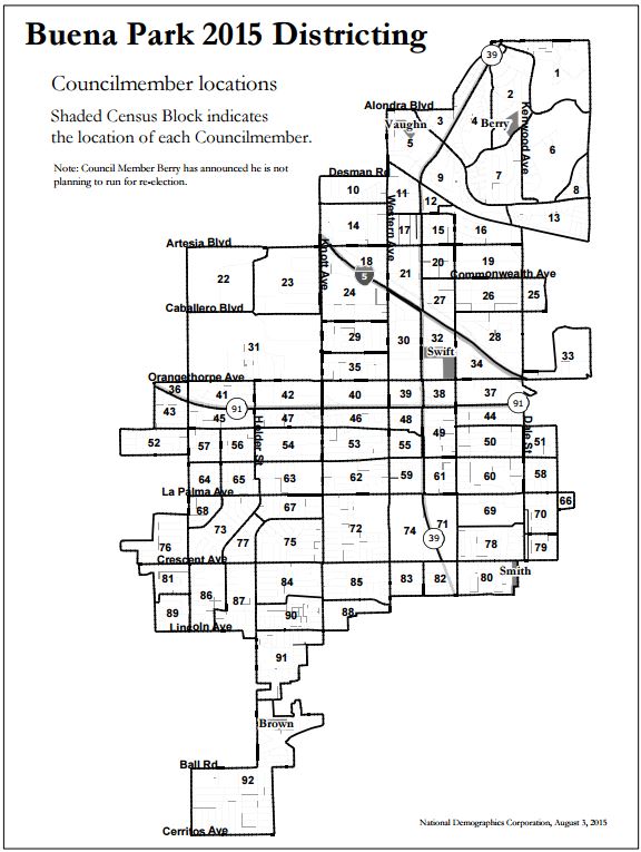
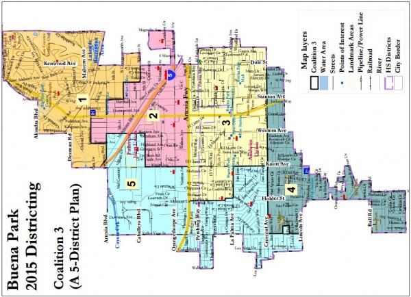
Population Units used in mapping and Current Council Member Residence Locations.
2. The Beginnings of Buena Park’s Mapping Process: “When We Were Four”
The rapid pace of Buena Park’s mapping project caught me and others by surprise. Buena Park decided in May 2015, in the face of rumblings about litigation, to go ahead and impose districts for its 2016 election. The project of getting community input didn’t get a lot of attention outside of the city until it was supposed to be almost done, at the end of October. The plan was to create four council districts who would serve along with a Mayor elected at large. This remains a possible outcome of Buena Park’s process, but a month ago things began to change. The Council was informed that high-density minority areas were too small to have a large role in districts taking up a quarter of the city. Here’s the raw material map-makers had to work with, for Asians and for Latinos.
[Note: due to the shape of Buena Park and the placement of text within maps created by Demographers at NDC, creating legible maps in a portrait (vertical) orientation is difficult — a problem that we can solve by rotating the maps counterclockwise. You can turn your head to see them “properly” or copy and rotate them in your computer or on your phone. But this odd orientation may provide some revelations as the viewer can see what’s in the map without preconceptions based on what they know of the city.]
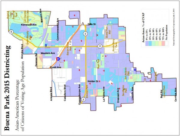
High-Density Asian areas are red, tan, and green; lower-density areas are turquoise, blue, and purple. (NOTE that due to the shape of Buena Park all maps will be rotated counterclockwise — so that NORTH IS TO THE LEFT — to allow for better viewing of details. If tilting your head troubles you, you can save the map and rotate it clockwise in your browser.)

High-Density Latino areas are red, tan, and green; lower-density areas are turquoise, blue, and purple. (NOTE that due to the shape of Buena Park all maps will be rotated counterclockwise — so that NORTH IS TO THE LEFT — to allow for better viewing of details. If tilting your head troubles you, you can save the map and rotate it clockwise in your browser.)
One can see more draft plans than I’ll reproduce here on the Demographers’s DRAFT PLANS PAGE. I’ll only address two of them right now: the “Orange” plan (which was the voting favorite among the initial set of citizen submissions) and the plan submitted by the Demographers themselves.
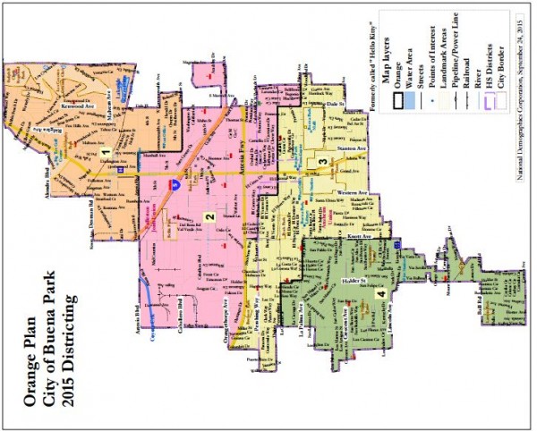
Orange Plan (4 districts). Rotated to fit page. NORTH IS TO THE LEFT!
If you apply these boundaries to the ethnic density maps above, you’ll see that the densest Asian and Latino portions of the city and split up with a lot of areas without lower density. So that makes it hard, unless one tries very deliberately to do so, to come up with a majority Latino district or a strong Asian plurality district.
In late October, a number of people realized, after looking at the first six rows of data in the map below, that the city was about to choose its new districts solely from a selection of community-submitted maps that uniformly failed by a wide margin to create a Latino CVAP majority district — despite that one was easily attainable. This is a good point to include the summary page from the Demographers comparing certain basic information across ALL actively considered maps; all but the final four rows are 4-district maps:
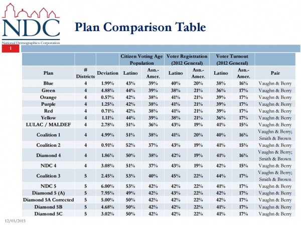
As you can see, the six 4-district “color” maps (from initial citizen applications) all have Latino districts with between 42% and 44% CVAP. For Asian districts, they varied between 38% and 39% CVAP pluralities — lower than attainable.
That brought LULAC and MALDEF, among others, into the fray and learning of their concerns brought me in as well. They submitted two 4-district maps for consideration on November 10 and I submitted one, as did the NDC Demographers.
Starting with the LULAC/MALDEF map — later transformed into the “Coalition” maps — Buena Park received its first map with a majority Latino CVAP district. Four other 4-district maps were offered: two by the Coalition, 1 by me (Diamond 4), and one by the Demographers (NDC 4). These varied between 50% and 52% Latino CVAP and 37% to 38% Asian CVAP. (Two, Coalition 1 and Diamond 4, also combined two incumbents, Smith and Brown, into one district, which was later determined to be contrary to the City’s districting criteria.)
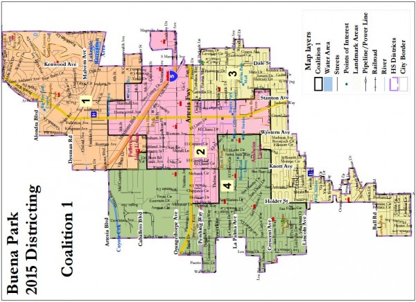
Coalition Map 1 (4 districts). Rotated to fit page. NORTH IS TO THE LEFT!
District 3, in yellow, is a quintessentially “Coalition”-type district. The LULAC maps tend to discard the criterion of compactness in favor of squeezing as many Latinos as necessary to create a Latino-majority district, here District 2. But with 4 districts, any district with a Latino-majority seat is bound to look at least a little strange.
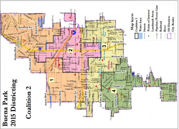
Coalition Map 2 (4 districts). Rotated to fit page. NORTH IS TO THE LEFT!
In Coalition map 2, it’s District 1 that unites communities one would not expect to find together.
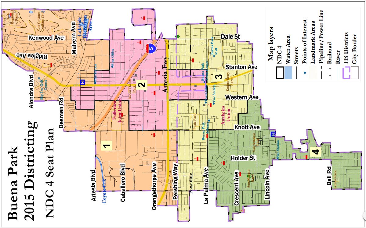
NDC Map 4 (4 districts) — rotated to fit page, NORTH is at LEFT.
The NDC 4-district map makes only slight changes from Coalition 2.
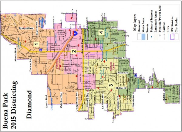
Diamond Map 4 (4 districts). Rotated to fit page. NORTH IS TO THE LEFT!
In my own 4-district map, I essentially decided that if Buena Park was going to have diagonal northeast-to-southwest districts, it might as well do so for the whole city. Districts 2 and 3 form a middle diagonal district that is then more or less chopped into two midway (using sort of a yin-yang pattern in the middle.)
The lesson here is: with 4 districts, one of which is a Latino CVAP najority district in the city’s east central section, the rest of the City is — one way or the other — going to look pretty weird. I accepted that as fate. Others, heroically, did not.
3. The Turning Point in Buena Park’s Mapping Process: Now We are Five
At this point, LULAC & company did something important and bold: they challenged the assumption that a mere four districts could achieve minority self-determination as well as five could. And they submitted a 5-district map as well to underscore the point. Here it is:
Coalition Map 3. Demographers’ 5-district map. (Rotated to fit page; NORTH IS AT LEFT.)
This was pretty gutsy — comparable to the decision of the Coalition behind the Reyes 2 map in Anaheim to tell the panel of judges that they would refuse the suggested changes offered by that city’s demographer and explain to the judges why they thought that one Latino-electoral-pool-majority districts (henceforth “Latino-majority” or “Latino CVAP majority) and two strong Latino plurality districts was preferable to two Latino majority districts and four where Latinos had little chance of affecting the results. As did that decision to take on the conventional wisdom change Anaheim’s process for the better, so did the decision to “break the rules” change Buena Park’s.
The Council seemed a bit stunned at having the rules changed on them, but by the end of the November 10 meeting they were seemingly disposed towards considering (and even preferring) such maps. They had their demographers create a 5-district mapping kit. The demographers also offered their own 5-district map. (Note that the demographers also take advantage of the ability to split Population Units, evident for example in the chip taken out of the bottom left portion of District 2 and given to District 5.
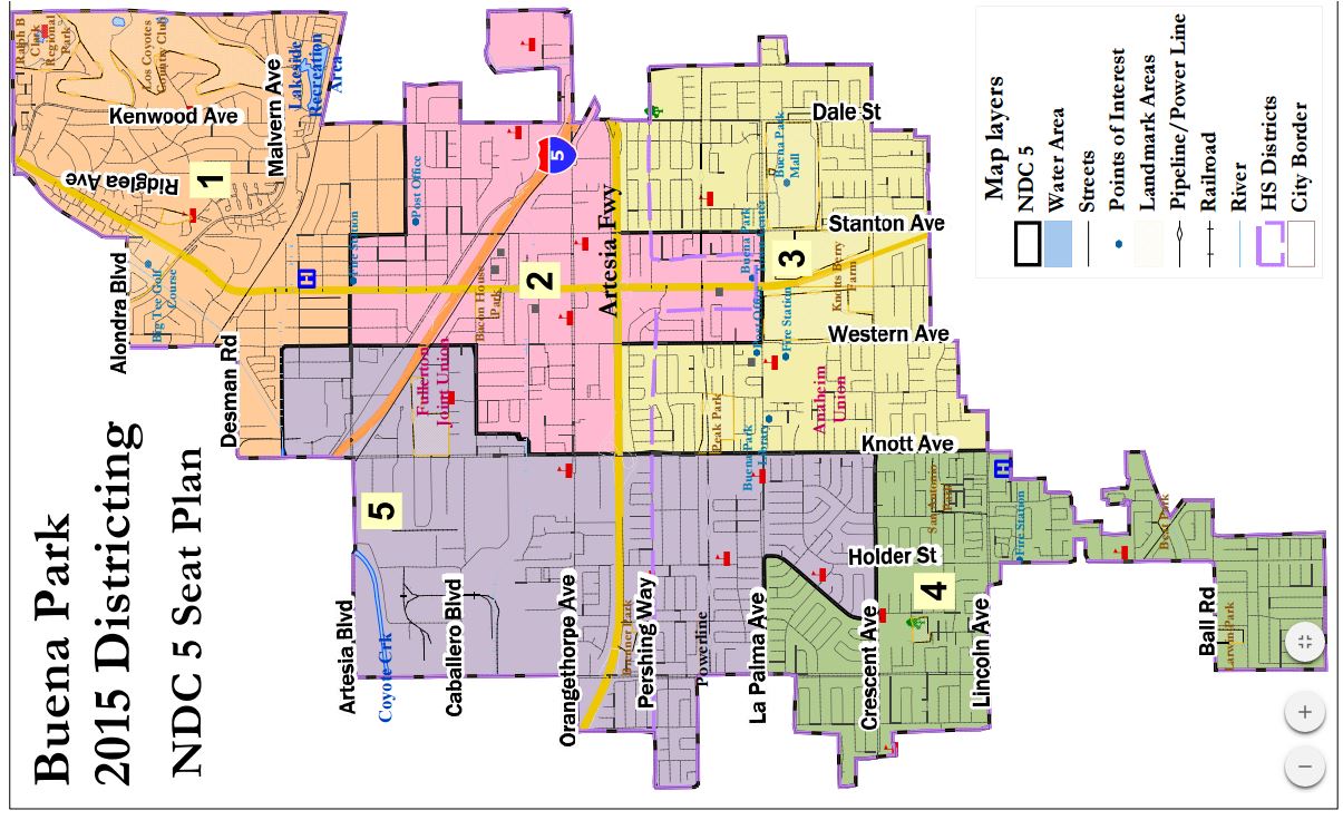
Demographers’ 5-district map. (Rotated to fit page; NORTH IS AT LEFT.)
Four other 5-district maps were created. One, entitled the Sadowinski Map, was (based on my research) probably submitted by Waldemar (“Val”) Sadowinski of the Los Coyotes area in District 1 — and it’s quite a good map!

Sadowinski Map (5 districts). Rotated to fit page. NORTH IS TO THE LEFT!
To compare the virtues of the 5-district maps, we’ll need to delve deeper into the statistics for each — but at this point it should at least be clear how much more logical and compact the 5-district maps are compared to the 4-district maps.
I submitted three maps, 5A, 5B, and 5C. (The “uncorrected” version of 5A, born of a misassignment of a district that the Demographer tried to fix in a way I didn’t prefer, doesn’t count.) Note that these are not three maps begun from scratch, but largely variations of the same map to allow the Council to choose the one that best fits its own preferred criteria. (I’ll just try to set out the differences when we get to the deep dive into the statistics.)
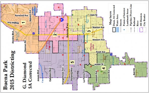
Diamond Map 5A (5 districts). Rotated to fit page. NORTH IS TO THE LEFT!
Comparing my Map 5A to my 4-district map, one can readily see how — despite districts having a few protrusions here and there (such as Districts 2 and 3 each having an incursion towards the bottom (west) of the map due to ethnic housing patterns and the need for relative equality of district size — one can actually visualize each of the five districts as more or “communities” in a way that is true of none of the 4-district maps that create a Latino-majority district.
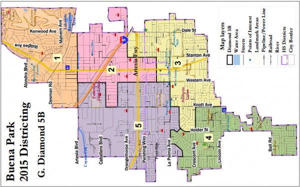
Diamond Map 5B (5 districts). Rotated to fit page. NORTH IS TO THE LEFT!
Diamond Map 5B differs only subtly from 5A — but these are the sorts of choices that one needs to make at the end of the process (which Buena Park is now reaching. Artesian Blvd. is now, as in the Sadowinski map, the southern border of all of District 1. District 2 gains some territory in its “southern peninsula” (extending to the right of the map) and gives up some territory to District three east of Stanton and south of Orangethorpe. Again, we’ll get into the implications of these changes down below, but the main effect is to create more of a “diagonal stairstep” northern border for District 3 — which may fit a little better with Latino housing patterns.

Diamond Map 5C (5 districts). Rotated to fit page. NORTH IS TO THE LEFT!
Diamond Map 5C moves just one population unit from District 3 to District 2, increasing the Latino CVAP of District 2 slightly and making La Palma the norther border for District 3 all of the way west of Beach Blvd. As I said, these differences are subtle — but appropriate to consider at the very end of the process.
4. Distinguishing among the 5-District Maps — Non-Statistical
Let’s start with the characteristics of the maps one can see from visual inspection alone, without looking at statistics.
The one map here that is most discrepant from the others is the “Coalition 3” map that started the revolution. Its District 3 is very — I’d say needlessly — compact, but at a cost elsewhere in the city. The lines between Districts 1 and 2 get awkward and diagonal, as the map-makers try to include as many Latinos as possible into District 2, even beyond the point of it having a Latino majority. This wouldn’t bother me if it also helped District 1 establish a stronger Asian plurality as well — but it does the opposite. (The map has other characteristics, such as placing Smith and Brown in the same 2016 district, which will likely limit its appeal to the Council.)
The NDC Map 5 scales down the raggedness of the District 1’s southern border, and leaves District 5 a bit more stretched out — and thus less of a compact community — than do the others. But the feature that bothers me more about this map is District 3, which has two northern portions on either side of the thick southern peninsula of District 2. That makes be feel that the district wouldn’t be that well-integrated — but the Council, which knows more about Buena Park than I ever will — may have good reason to disagree.
The Sadowinski Map gives more compact versions of Districts 2 and 3 than do the Diamond 5B and 5C maps, but less compact versions of Districts 4 and 5. This is exactly the sort of judgment call that the Council would make. The only problem I have with this map is a statistical one, which appears in the next section.
Diamond 5A has District 1 extend south of Artesia Blvd., which — especially after looking at the Sadinowski Map, I’ve come to believe is not a good thing. Other than that, its differences with 5B and 5C involve the border between Districts 2 and 3, north of the 91 between Stanton and Dale — and all three Diamond 5-district maps differ in the placement of the city block north of La Palma between Western and Beach.
And now it is time to look at the statistics.
5. Distinguishing among the 5-District Maps — Statistical
Let’s return to this excerpt from the Plan Comparison document above:
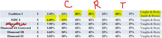
Columns marked “C” address Latino and Asian CVAP (respectively); “R” represents 2012 voter Registration numbers; and T is for 2015 voter Turnout. Sadowinki’s numbers appear below.
The Sadowinski numbers, I had not realized, are missing from the plan comparison: They are:
Districts: 5. Total deviation: 6.55%.
District 2 Latino CVAP: 49%; Registration: 43%, Turnout: 42%.
District 1 Asian CVAP: 42%; Registration: 22%; Turnout: 17%.
Starting from the top: the Coalition 3 map ties with the NDC map for the highest (53%) Latino CVAP in District 2, but it also has the lowest (40%) Asian CVAP in District 1 — a trade-off that seems questionable. In its favor — and this is arguably a good enough reason to prefer it to the others — the Latino voter eigstration and turnout in its District 3 are each between 2 and 3 points higher than the others. (My reaction to that is that when a Latino candidate runs in these districts, under a District Election system, the Registration and Turnout differences will change, with the help of that person’s campaign, on their own.) Finally, again, by extending the southernmost district all the way to the city’s eastern border it forces a map between two incumbents, which no other map does (and which seems questionable as a matter of geography even without that.)
The NDC map has the highest discrepancy from equal representation of any 5-district map still under consideration except Sadowinski. Interestingly, its higher Latino CVAP in District 2 doesn’t translate into higher registration and turnout there; in fact, it’s turnout is lower than in the Diamond 5A and Sadowinski maps.
The Sadowinski map has two statistical problems. First, its Latino CVAP is under 50%, meaning that it is not a majority Latino CVAP district. Second, its total deviation from equal representation is the highest of any of the remaining 5-district maps up for consideration.
The Diamond 5A and 5B maps are almost identical in these summary statistics: neither exceeds 5% deviation (although just barely) and the other figures are the same except for a slight Latino turnout advantage for 5A. The big problem with 5A isn’t apparent from the summary table: it makes the 50% CVAP figure only by rounding — for example, 49.6% CVAP rounds to 50%, but it is not actually a Latino CVAP majority. I’m not sure that it matters — but it did goad me into creating the other two maps, in each of which District 2 is a bona fide Latino majority district. (Again, this is barely: in 5B, District 2 has 3,224 Latinos out of 6,436 citizens of at least age 18; in 5C it’s 3,291 out of 6,565. That’s what made the process so bloody involved.)
Primarily because of its lower total deviation, I narrowly prefer Diamond 5C over Diamond 5B. But if the Council wanted to choose Sadowinski — ideally with a little tinkering to get its District 2 Latino CVAP above 50.0% (and maybe to lower its deviation a little to under 5%) — I would be entirely satisfied. My concerns about the 5-district NDC and Coalition maps are presented above — but each is way better than even the best of the 4-district maps.
Here are the worksheet tables (which is what I could review while I was drawing the maps) for Diamond Maps 5B and 5C. If anyone needs an explanation of them, let me know.
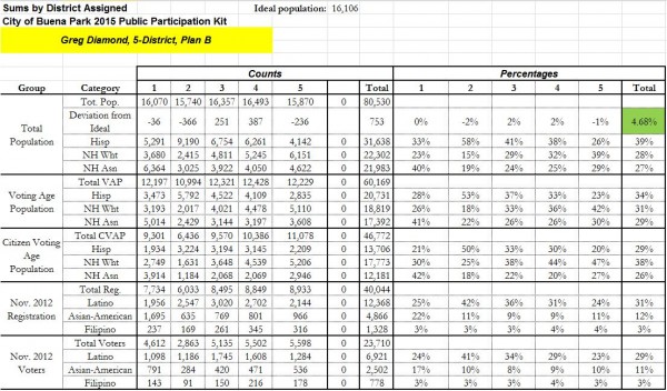
All the statistics you’d want to know about the Diamond 5B map (except for the demographic ones that don’t appear here.)

All the statistics you’d want to know about the Diamond 5C map (except for the demographic ones that don’t appear here.)
So long as some 5-district map is chosen, this process should be considered a success — and for that, even though I don’t prefer their maps, the major credit goes to LULAC. We’ll see what happens on Tuesday night.
NOTE: If you got this far, you may not need the “executive summary” — but click there if you want it!
Just did not want to see one of your posts get 0 comments. Interesting analysis.
What I know about Buena Park… well, I looked for a park there once and couldn’t find one.
Also Jesus Aguirre and Renee Balenti. And the bad cops Woo and the Yak, both of em disciplined, the latter after leading a posse into Orange to railroad our friend Paul Lucas.
Knott’s Berry Farm is a theme park. And a pretty buena theme park at that!
Oh, I don’t mind. I can see how many hits it’s getting, and it’s been getting a fair number of readers. But thanks!